WasteWise - Food Waste Analytics Dashboard for Restaurants

Title
WasteWise
Role
UX/UI Designer
Date
2026
Project Context
WasteWise is a food waste analytics dashboard designed for restaurant managers and kitchen operations teams. The idea for this project came from a common problem in restaurants: food waste is expensive, but it is often hard to track clearly and act on in time.
Many restaurants collect waste information through spreadsheets, staff notes, POS data, or informal kitchen communication. This makes it difficult for managers to understand which ingredients or dishes are causing the biggest losses, why the waste is happening, and what should be changed before the next order or prep cycle.
The goal of WasteWise is to bring this information into one clear dashboard. The platform helps managers monitor food waste by category, identify dishes with the highest losses, understand the cost of waste, and use demand forecasts to make better preparation decisions.
The main challenge was to design a dashboard that feels useful during a busy workday. The interface needed to be easy to scan, focused on the most important problems, and clear enough for managers who are comfortable with numbers but do not have time for deep data analysis.

User Persona
Mara Reuter is a restaurant manager who runs a two-location bistro. She handles food orders, staff schedules, kitchen prep, and food costs. She uses spreadsheets and reports, but she doesn't have time to dig through lots of data every day.
One of her biggest challenges is food waste. Information is often spread across spreadsheets, kitchen notes, and conversations with the team. Because of this, it's hard to spot problems early and make changes before the next order is placed.
Mara needs a simple tool that helps her quickly see what is being wasted, why it's happening, and what she can do to reduce it. Her goal is to make better decisions, save money, and keep food waste under control.

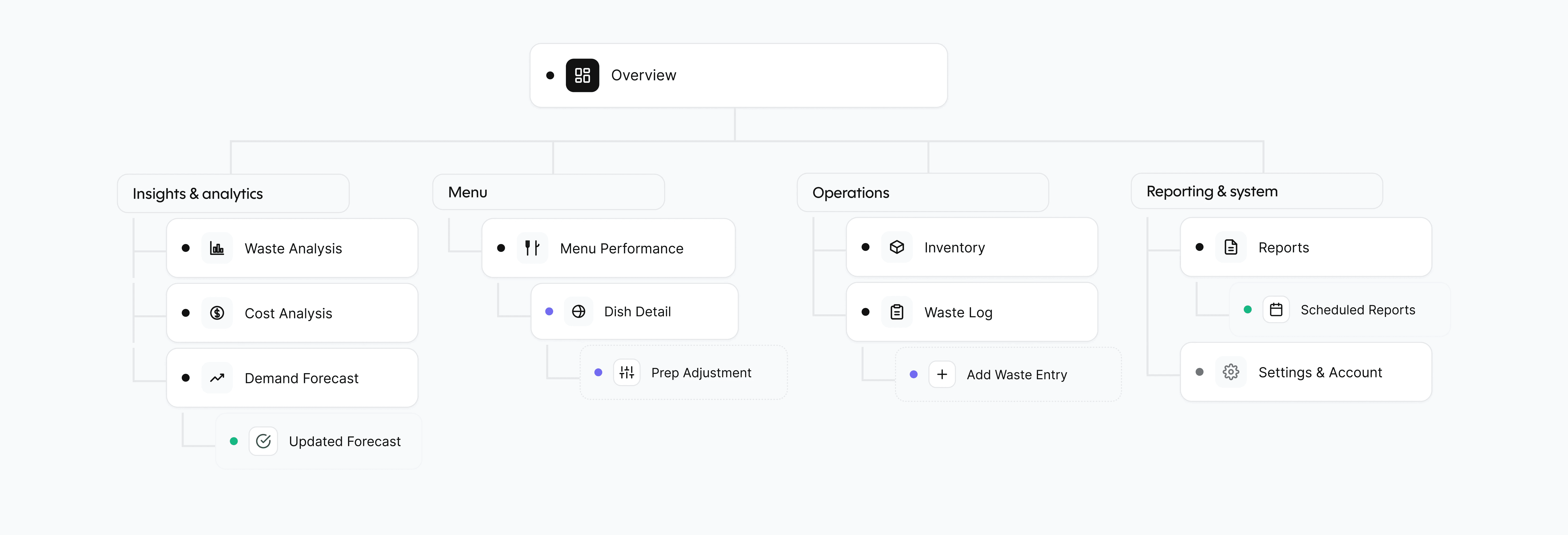
Information Architecture
The structure of WasteWise is designed around the manager's workflow: understand the problem, analyze it, and take action.
The Overview page serves as the main entry point, providing a quick summary of food waste performance and highlighting the most important issues that require attention.
The platform is divided into four key areas (not visually). The first area focuses on insights and analytics, helping managers understand waste trends, financial impact, and future demand through waste analysis, cost analysis, and demand forecasting tools.
The second area is dedicated to menu performance.
Here, managers can compare dishes, identify items with high waste rates, review profitability, and explore detailed dish-level insights along with recommended actions.
The operations area supports day-to-day restaurant activities. It includes inventory management and waste logging features that help teams monitor stock levels, track expiry dates, and record waste accurately as it occurs.
The final area focuses on reporting and system management. Managers can generate reports, schedule recurring reports for stakeholders, and manage system settings to support ongoing monitoring and communication across the business.
User Flow
The main user flow helps the manager find a waste problem and take action.
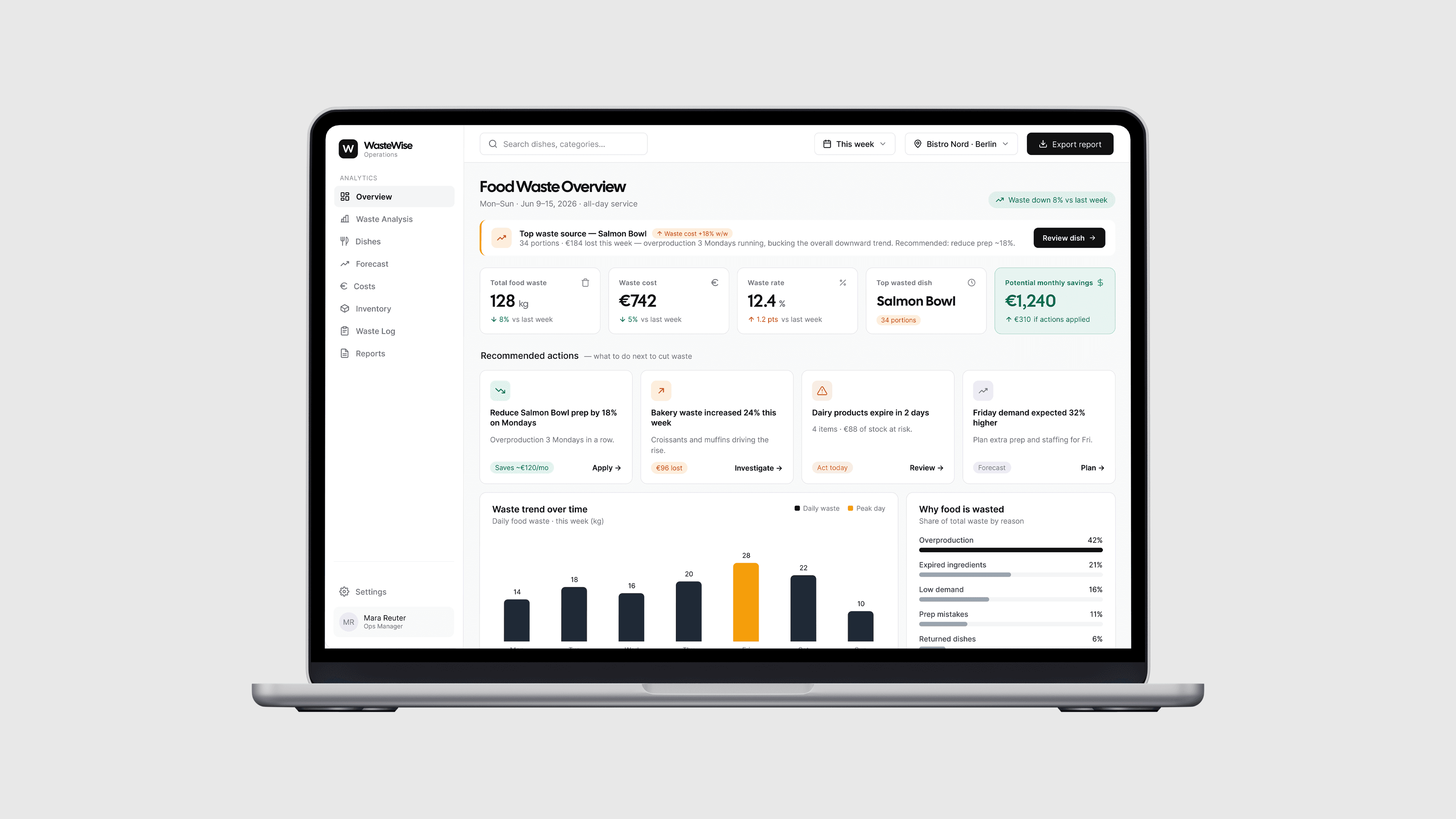
The process starts when the manager receives an alert that food waste costs have increased. After opening the dashboard, they can immediately see the biggest issue of the week, such as Salmon Bowl generating the most waste.
Next, they open the Dish Detail page to learn more. The system shows waste data and a recommendation to adjust preparation amounts. The manager can review the recommendation, make changes if needed, and apply the adjustment. Once confirmed, the system updates the forecast and shows the expected savings.

Low-fi Wireframes

User Flow Screens

The flow starts on the Overview dashboard. The manager immediately sees the most important issue of the week: Salmon Bowl is the top waste source, with 34 wasted portions and €184 lost. The alert is placed near the top of the page so it is hard to miss. Instead of only showing general statistics, the dashboard highlights a clear problem and gives the user a direct action: review the dish.
This helps the manager understand what needs attention without searching through reports. The overview also shows key metrics such as total food waste, waste cost, waste rate, top wasted dish, and potential monthly savings.

After clicking “Review dish,” the manager moves to the Salmon Bowl detail page. This screen explains why the dish is causing losses. The page shows prepared portions, sold portions, wasted portions, waste cost, and waste rate. The charts help the manager compare what was prepared with what was actually sold and wasted during the week.
The most important part of this screen is the recommendation card. It explains that Monday demand is consistently low and suggests reducing Salmon Bowl prep by 18% on Mondays. This turns the data into a clear decision instead of leaving the manager to interpret the charts alone.

Before applying the change, the manager sees a confirmation modal. This step gives them time to review the recommendation and understand what will change.
The modal compares the current prep amount with the recommended prep amount: from 80 portions to 64 portions. It also shows the expected impact, including weekly savings, fewer wasted portions, and forecast confidence. A short explanation supports the recommendation with evidence from recent Mondays. A warning also reminds the manager that reducing prep could increase the risk of selling out if demand suddenly rises. This makes the decision feel more transparent and controlled.

After the manager applies the recommendation, the system shows a success state. This confirms that the new prep amount has been saved for Monday lunch service. The modal shows the previous prep, the new prep, and the expected impact. It also explains what happens next: the kitchen team will see the updated prep amount, the forecast will be monitored, and WasteWise will notify the manager if demand changes.

The final screen shows the updated demand forecast after the prep adjustment has been applied. The manager can now see how the change affects future preparation planning.
The screen highlights the new Monday prep amount, projected weekly waste reduction, recovered savings, and forecast confidence. The chart compares previous prep, forecast demand, and updated prep, making it easy to see that the new plan is better aligned with expected demand. The table below shows updated prep targets for each day of the week. This gives the manager a practical plan that can be shared with the kitchen team. The flow ends with next-step actions, such as pushing the prep list to inventory or applying a similar adjustment to other dishes.
Additional Product Screens

The Cost Analysis screen focuses on the financial impact of food waste. It helps the manager understand not only how much food is being wasted, but how much money the restaurant is losing because of it.
At the top of the screen, the manager can quickly see the total waste cost, average daily loss, potential monthly savings, and the category with the highest cost. This makes the financial problem clear from the first glance. The main chart shows how waste cost changes throughout the week, making it easy to spot expensive days. The cost by category section shows where the money is being lost, such as prepared dishes, fish, bakery, dairy, and vegetables. The table at the bottom breaks the cost down by dish. This helps the manager compare waste cost, lost revenue, potential savings, and priority.

The Waste Analysis screen helps the manager understand where waste comes from and why it happens. This screen includes filters for time period, category, and shift, so the manager can narrow the data down to a specific service or food group. The waste by category section shows which types of food create the most waste, while the waste by reason chart explains the main causes, such as overproduction, expired ingredients, low demand, or prep mistakes. The screen also shows waste trends by day and waste by shift.

The Inventory screen connects food waste with stock management. It helps the restaurant monitor ingredients, expiry dates, low stock items, and products that may create a high waste risk.
The KPI cards at the top give a quick overview of the current stock situation, including total items, low stock items, expiring products, and overstocked items. The inventory table gives the manager a clear view of each item, its category, current stock, expiry date, status, suggested order, and waste risk. This helps the team make better ordering decisions and avoid both shortages and overstocking.
This screen is important because many waste problems start before food is cooked. If stock is not managed well, ingredients can expire, be ordered in the wrong quantity, or create unnecessary waste.

The Waste Log screen shows how waste data is recorded in the system. Every logged waste entry includes the date, item or dish, category, quantity, reason, shift, staff member, and estimated cost. This screen gives the manager a clear record of what was wasted and why. Filters allow the user to check waste by category, reason, shift, staff member, or time period.

The Reports screen helps the manager share insights with the owner, finance team, or kitchen staff. It includes different report types, such as Weekly Waste Summary, Cost Analysis Report, Menu Performance Report, Inventory Risk Report, and Demand Forecast Report. Each report can be exported as a PDF or CSV, depending on how the information needs to be shared.
The scheduled reports section allows the manager to automate regular updates. For example, a weekly waste summary can be sent to the owner every Monday, while an inventory risk report can be sent to the kitchen team every morning.
Conclusion
WasteWise was designed to help restaurant managers understand food waste faster and turn data into clear actions. The dashboard brings together waste tracking, cost analysis, dish performance, forecasting, inventory, and reports in one place. The final solution focuses on practical decision-making. Instead of only showing numbers, WasteWise highlights the most important problems, explains why they happen, and guides the manager toward actions that can reduce waste and save money.