Real Estate Website UX Redesign
Title
Urban Oasis
Role
UX/UI Designer
Date
2026
Project Context
The original version of this real estate website was created by me in 2024. Looking back at the project now, with more experience in UI/UX design, I noticed that although the visual direction was already established, many decisions could be improved from a usability and user flow perspective.
I decided to redesign the project as an opportunity to revisit my earlier work, identify its weaknesses, and improve it through a more intentional design process.
This redesign focuses on iteration: refining the structure, improving the hierarchy of information, reducing unnecessary friction, and making the interface better aligned with the main user goal - finding a suitable property quickly and easily. By comparing the original version with the redesigned one, I wanted to show not only the final visual result, but also my ability to critically evaluate my own work, make UX-driven decisions, and improve an existing digital product.
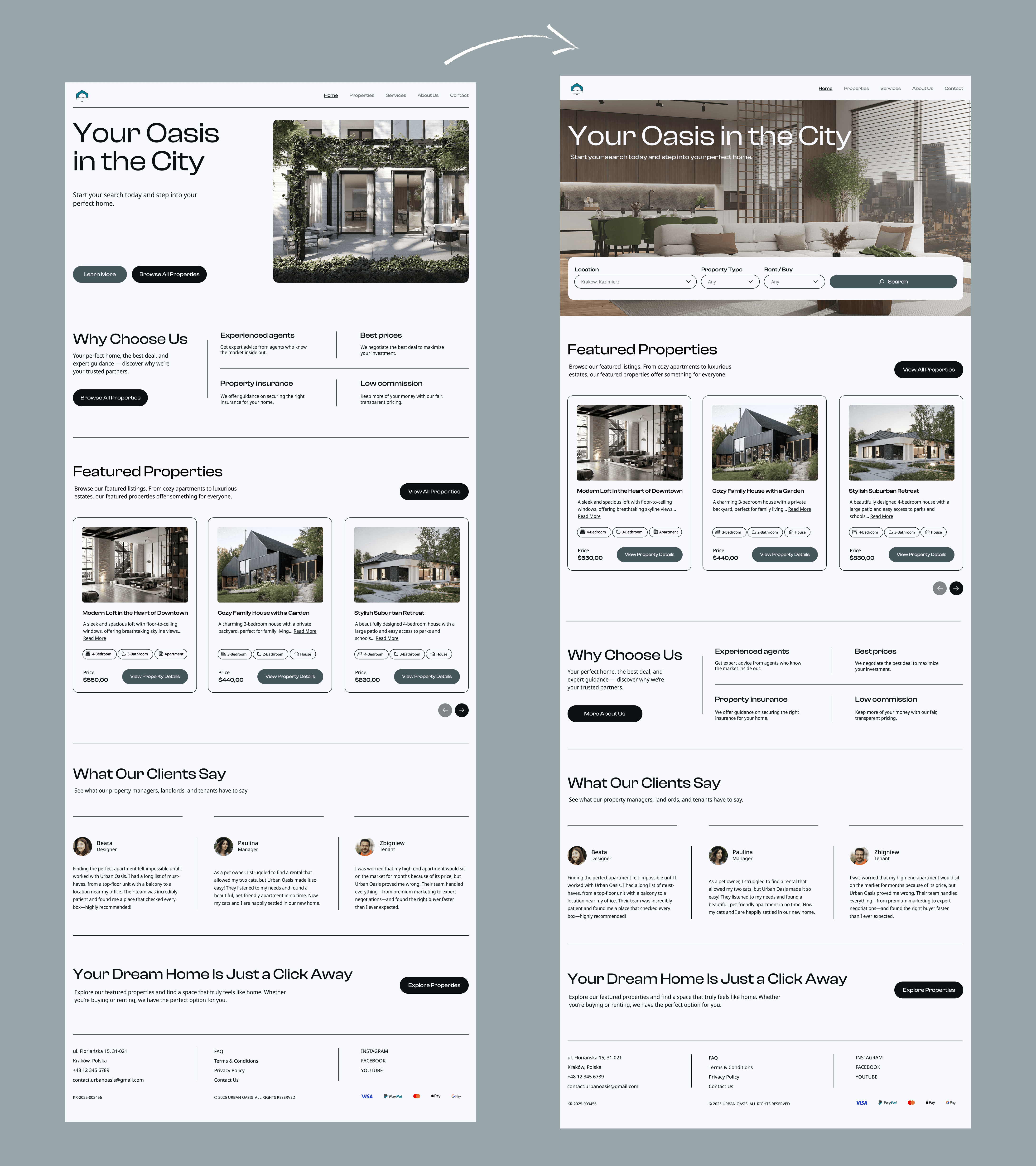
Homepage Redesign
The homepage layout was restructured to better support the primary user goal: finding a suitable property as quickly and efficiently as possible. In the previous version, informational content such as the “Why Choose Us” section appeared too early in the page hierarchy. In the redesigned version, the Featured Properties section was moved higher on the page. This shortens the user journey and allows visitors to immediately start exploring available offers without unnecessary scrolling.
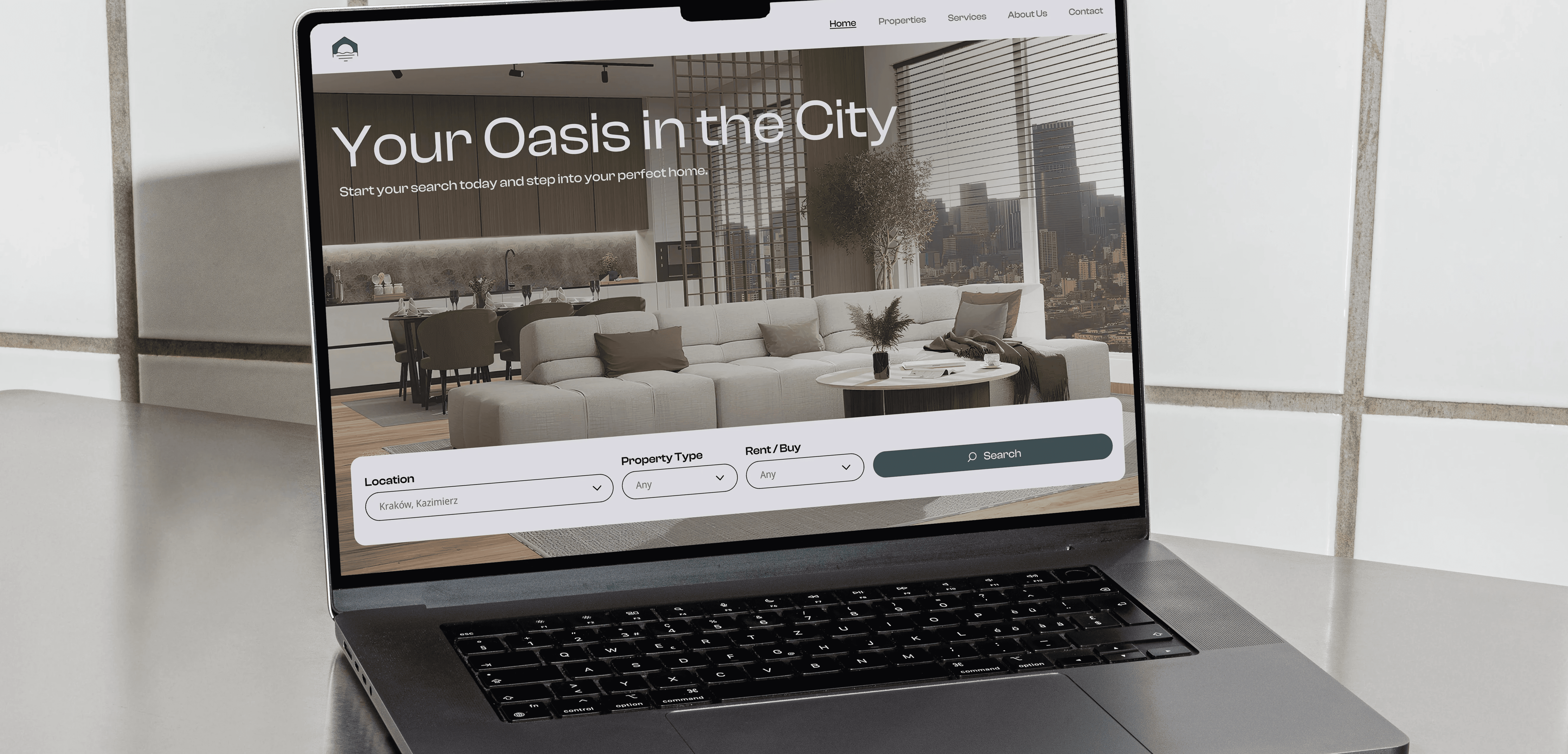
Another major improvement was the addition of a search bar directly inside the hero section. Instead of treating search as a secondary action, it now becomes the central interaction on the homepage. The search bar was intentionally designed as a single-row component. Instead of displaying a complex advanced search form immediately, the homepage search includes only the most essential criteria: location, property type, and transaction type - rent or buy. This makes the interface feel lighter and less intimidating for first-time users. By reducing the number of visible fields, the redesign lowers cognitive load and encourages users to start searching without feeling overwhelmed. More detailed filters remain available later on the search page, where users are already more engaged in the browsing process.
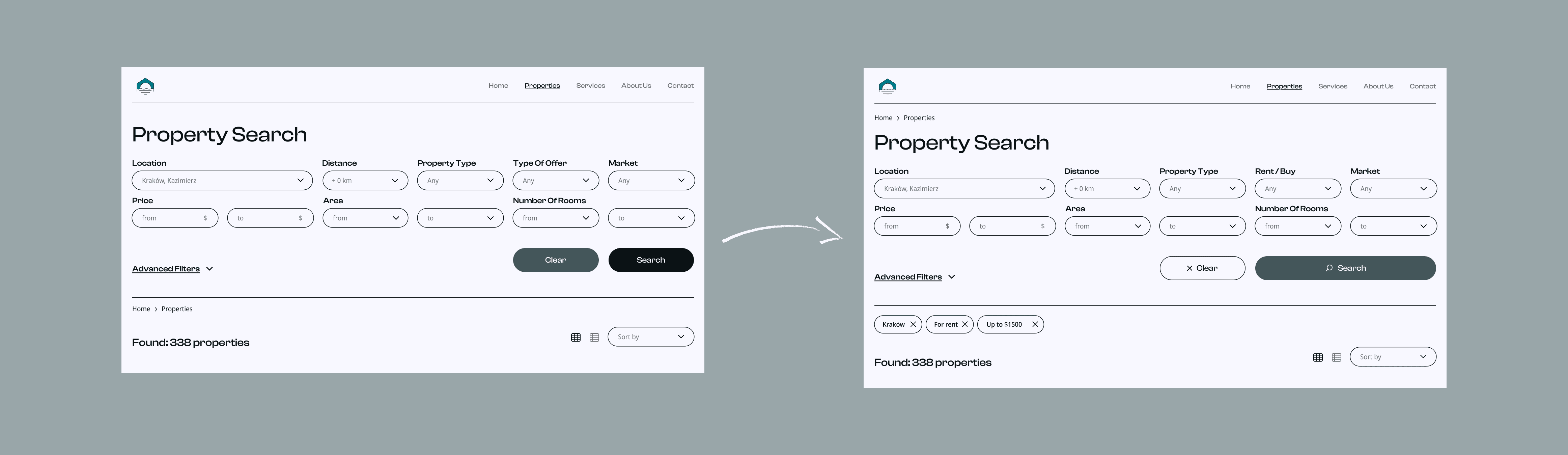
Search Filters
The filtering system was redesigned to improve clarity, efficiency, and user control during the property search process.
One of the most important additions is the introduction of active filter chips displayed below the filter bar. These chips provide immediate visual feedback by showing which filters are currently applied. Users can now quickly review active criteria and remove individual filters with a single click, without reopening the entire filtering form. This reduces interaction cost and improves usability, especially during more advanced searches.
The action hierarchy within the filtering system was also improved. In the previous version, the Clear and Search buttons competed visually for attention, despite having different levels of importance.
In the redesigned interface search remains the primary CTA and is visually emphasized, the button now includes a search icon for stronger affordance, while "Clear" was redesigned as a secondary action. This change creates a more logical visual hierarchy and guides users toward the main goal - performing a search - instead of accidentally resetting filters.
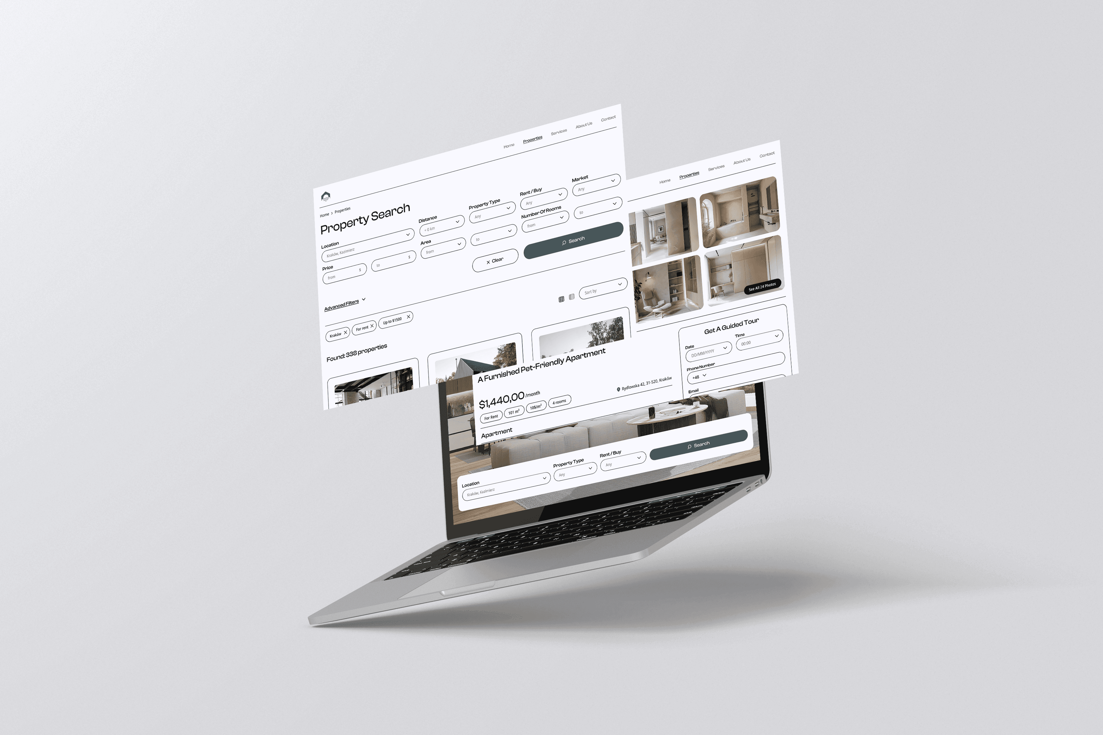
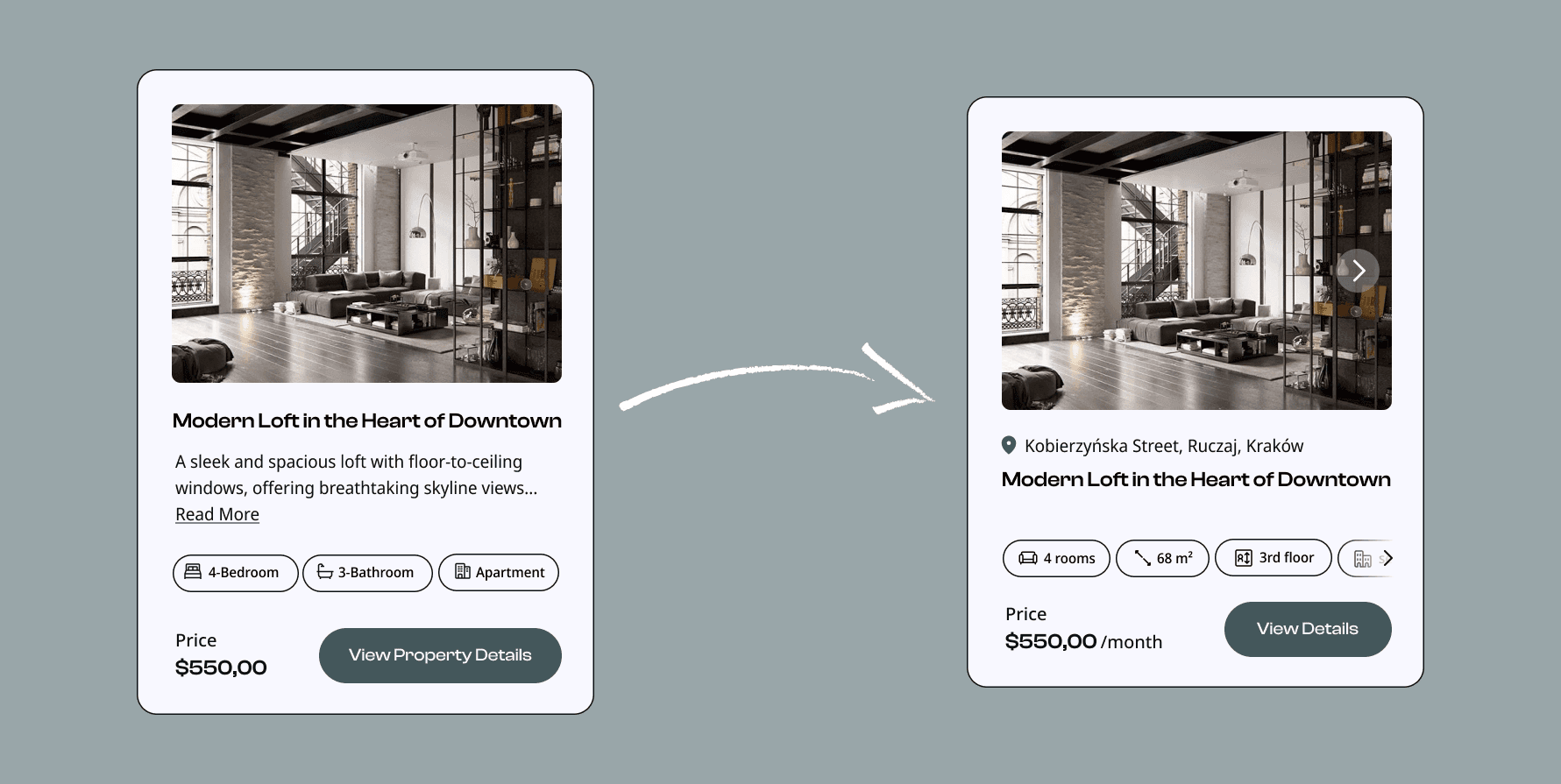
Property Cards
The property cards were redesigned to improve scanability and allow users to compare offers without opening every listing individually. In the original version, important details were hidden behind the property page, forcing users to perform unnecessary clicks and slowing down the decision-making process.
The redesigned cards now display key information directly on the preview card, including property size, floor number, number of rooms and primary or secondary market status. Adding this information significantly improves usability because users can quickly evaluate whether a listing matches their needs before entering the detailed view.
The property description text was removed from the cards. During the redesign process, it was identified as low-value content that increased visual clutter and reduced readability. The CTA button label was also simplified from “View Property Details” to “View Details.” The previous version was unnecessarily long and visually heavy. The shorter CTA improves readability, creates a cleaner interface, and maintains clarity without losing meaning.
Additionally, the location of each property was added to the card layout. This allows users to better orient themselves geographically and compare listings more effectively without needing to open multiple pages.

Property Details Page
The property details page was redesigned to improve content hierarchy, increase the visibility of important actions, and make the interface feel more functional and realistic from a user experience perspective.
One of the most significant changes is the redesign of the right-side panel. In the previous version, this section had lower visual priority and functioned mostly as a supporting element. In the updated design, the panel is more prominent and visually separated from the informational content, making key actions easier to notice and access. As a result, the page is easier to scan and navigate, especially for users comparing multiple offers.
The redesign places greater emphasis on user conversion goals, particularly scheduling a property viewing. Instead of using a decorative calendar component with limited functionality, the new version introduces a real appointment booking system. Users can now choose a date, select a preferred time, provide contact details and schedule a property tour directly from the page.
This change transforms the interface from a static presentation page into a more interactive and task-oriented experience. It also creates a stronger connection between browsing and taking action, reducing friction in the user journey.


Conclusion
This redesign helped transform the project from a visually clean real estate website into a more user-centered and functional digital product.
The main focus of the redesign was to make the property search process faster and easier. Important functions, such as search, filtering, property comparison, and booking a guided tour, were made more visible and intuitive. At the same time, unnecessary visual clutter was reduced, allowing users to focus on the information that supports their decision-making process.
This project also shows the value of iteration in design. Returning to an older project with new knowledge allowed me to improve not only the interface itself, but also the logic behind the user experience. The redesign demonstrates my ability to analyze my own work critically, recognize usability problems, and create more purposeful design solutions based on real user goals.
Overall, the updated version provides a clearer structure, stronger visual hierarchy, and a smoother journey from searching for a property to taking action.
