GREEN HORIZON
Most travel apps show too many options and focus on mass tourism, which makes it hard to find real eco-friendly experiences. It’s also difficult for users to understand what is truly sustainable and what is just greenwashing. The challenge was to design a simple and clear product that helps users find meaningful trips they can trust.

Title
GREEN HORIZON
Role
UX/UI Designer
Date
2025
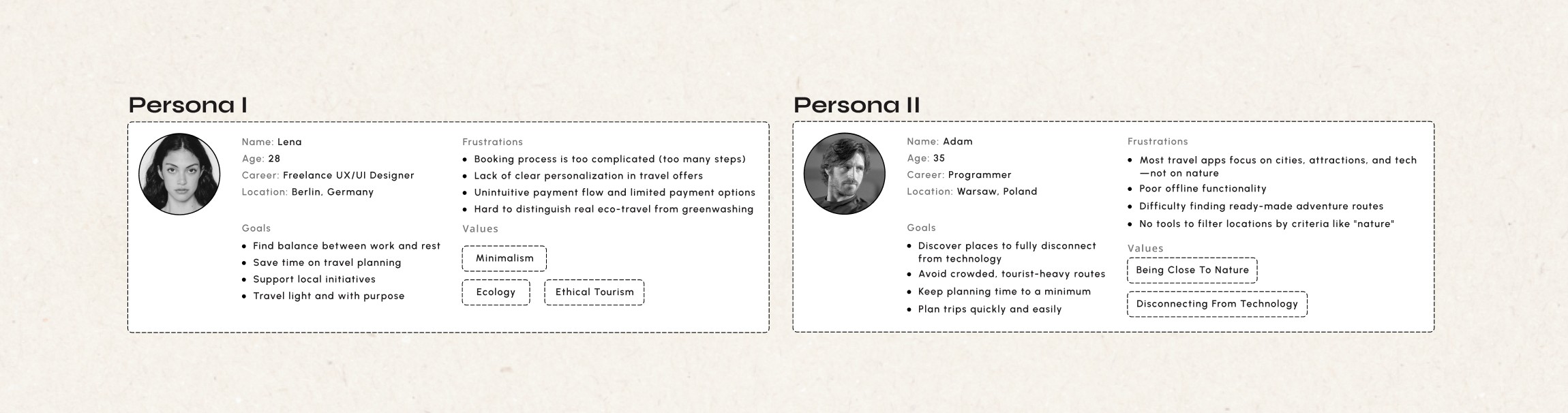
Personas & Empathy Maps
To better understand the audience, I developed two contrasting personas - a conscious traveller seeking meaningful, ethical experiences, and a minimalist explorer looking to disconnect from technology and reconnect with nature. Empathy maps allowed me to dive deeper into users motivations, frustrations, and emotional triggers.

Key Insights
Simplicity over complexity: users value quick, intuitive flows.
Personalization drives engagement: users want recommendations that match their values.
Trust is critical in eco-travel: users struggle to distinguish real eco-friendly experiences from greenwashing.
Meaningful travel: users want their trips to have purpose.
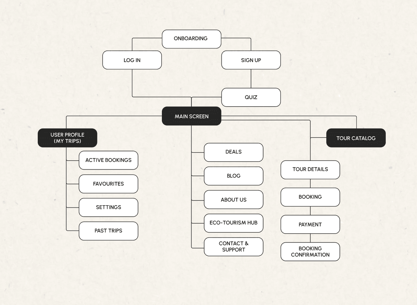
Information Architecture
I created a clear app structure to help users easily move from onboarding to booking. The focus was on simplicity and personalization, making the experience smooth and easy to follow.
Low-fidelity Wireframes
I created low-fidelity wireframes to rapidly explore layout and user flows, focusing on clarity and usability. This stage helped validate the structure early and iterate quickly before moving into high-fidelity design.

Onboarding & Quiz Experience
Instead of a traditional onboarding, I designed an intentionally minimal flow, with no long forms or overwhelming choices. By integrating the quiz into onboarding, the experience feels less like setup and more like the beginning of a journey. I wanted to make here a moment of reflection for user: Where do I actually want to go, and why?
The goal was to make the first interaction feel light and natural, while still collecting meaningful data. Clear progress indicators, simple questions, and the option to skip ensure flexibility and ease of use.


Home & Discovery / Search & Filtering
At the home screen layout focuses on curated content: recommended tours, destinations, and educational sections about eco-tourism. This allows users to discover new places while still feeling in control of their journey. To support quick and intentional planning, I designed a flexible filtering system that goes beyond standard travel apps: users can filter not only by destination or price, but also by values - such as activity type, nature experience, or eco-related tags.
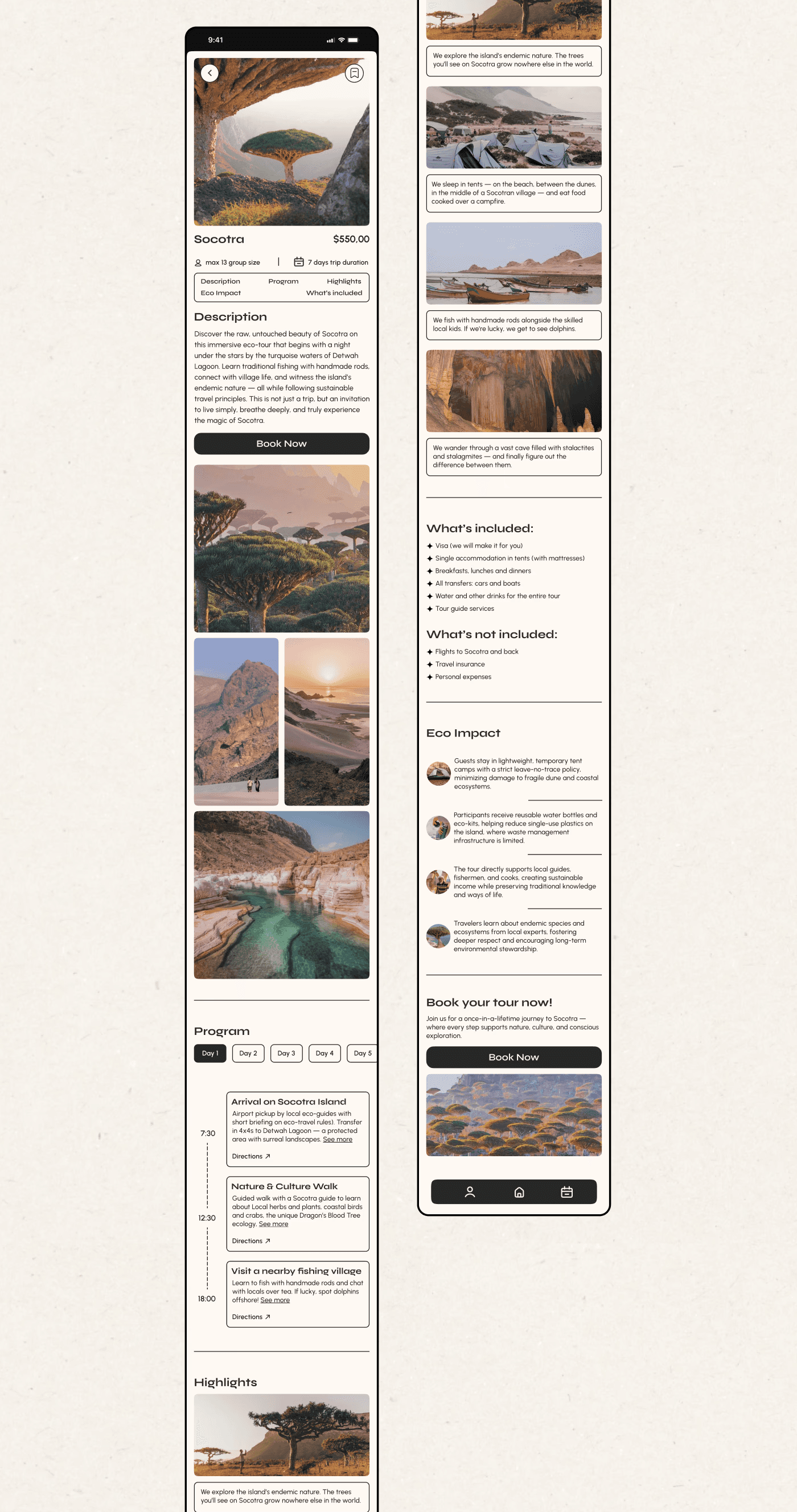
Tour Details Experience
The tour details page is built to tell a story, not just present information. Instead of generic descriptions, the page highlights:
Real experiences (what you’ll actually do)
Clear inclusions and logistics
Eco impact of the trip
User Profile
The profile is designed as a personal travel space where users can easily track their journeys. Clear separation between upcoming, completed, and saved trips helps users stay organized and in control.
Booking & Payment Flow
The booking flow is intentionally straightforward and transparent. Users can select dates, number of travellers, and payment methods in a few clear steps.


Eco Tourism Hub
The Eco Tourism Hub acts as an educational and trust-building layer within the app. It provides clear explanations, FAQs and information helping users better understand what eco-travel means.
GREEN HORIZON
Most travel apps show too many options and focus on mass tourism, which makes it hard to find real eco-friendly experiences. It’s also difficult for users to understand what is truly sustainable and what is just greenwashing. The challenge was to design a simple and clear product that helps users find meaningful trips they can trust.
Title
GREEN HORIZON
Role
UX/UI Designer
Date
2025
Personas & Empathy Maps
To better understand the audience, I developed two contrasting personas - a conscious traveller seeking meaningful, ethical experiences, and a minimalist explorer looking to disconnect from technology and reconnect with nature. Empathy maps allowed me to dive deeper into users motivations, frustrations, and emotional triggers.
Key Insights
Simplicity over complexity: users value quick, intuitive flows.
Personalization drives engagement: users want recommendations that match their values.
Trust is critical in eco-travel: users struggle to distinguish real eco-friendly experiences from greenwashing.
Meaningful travel: users want their trips to have purpose.
Information Architecture
I created a clear app structure to help users easily move from onboarding to booking. The focus was on simplicity and personalization, making the experience smooth and easy to follow.
Low-fidelity Wireframes
I created low-fidelity wireframes to rapidly explore layout and user flows, focusing on clarity and usability. This stage helped validate the structure early and iterate quickly before moving into high-fidelity design.
Onboarding & Quiz Experience
Instead of a traditional onboarding, I designed an intentionally minimal flow, with no long forms or overwhelming choices. By integrating the quiz into onboarding, the experience feels less like setup and more like the beginning of a journey. I wanted to make here a moment of reflection for user: Where do I actually want to go, and why?
The goal was to make the first interaction feel light and natural, while still collecting meaningful data. Clear progress indicators, simple questions, and the option to skip ensure flexibility and ease of use.
Home & Discovery / Search & Filtering
At the home screen layout focuses on curated content: recommended tours, destinations, and educational sections about eco-tourism. This allows users to discover new places while still feeling in control of their journey. To support quick and intentional planning, I designed a flexible filtering system that goes beyond standard travel apps: users can filter not only by destination or price, but also by values - such as activity type, nature experience, or eco-related tags.
Tour Details Experience
The tour details page is built to tell a story, not just present information. Instead of generic descriptions, the page highlights:
Real experiences (what you’ll actually do)
Clear inclusions and logistics
Eco impact of the trip
User Profile
The profile is designed as a personal travel space where users can easily track their journeys. Clear separation between upcoming, completed, and saved trips helps users stay organized and in control.
Booking & Payment Flow
The booking flow is intentionally straightforward and transparent. Users can select dates, number of travellers, and payment methods in a few clear steps.
Eco Tourism Hub
The Eco Tourism Hub acts as an educational and trust-building layer within the app. It provides clear explanations, FAQs and information helping users better understand what eco-travel means.